
Have you ever wondered where we get our energy in the United States and how we use it?
Or how large an impact coal makes compared to wind power and solar energy? Or whether cars and trucks use more energy than homes? Researchers at Lawrence Livermore Labs have been collecting data from the Department of Energy’s Energy Information Administration for years and making detailed “flow diagrams” that answer all those questions.
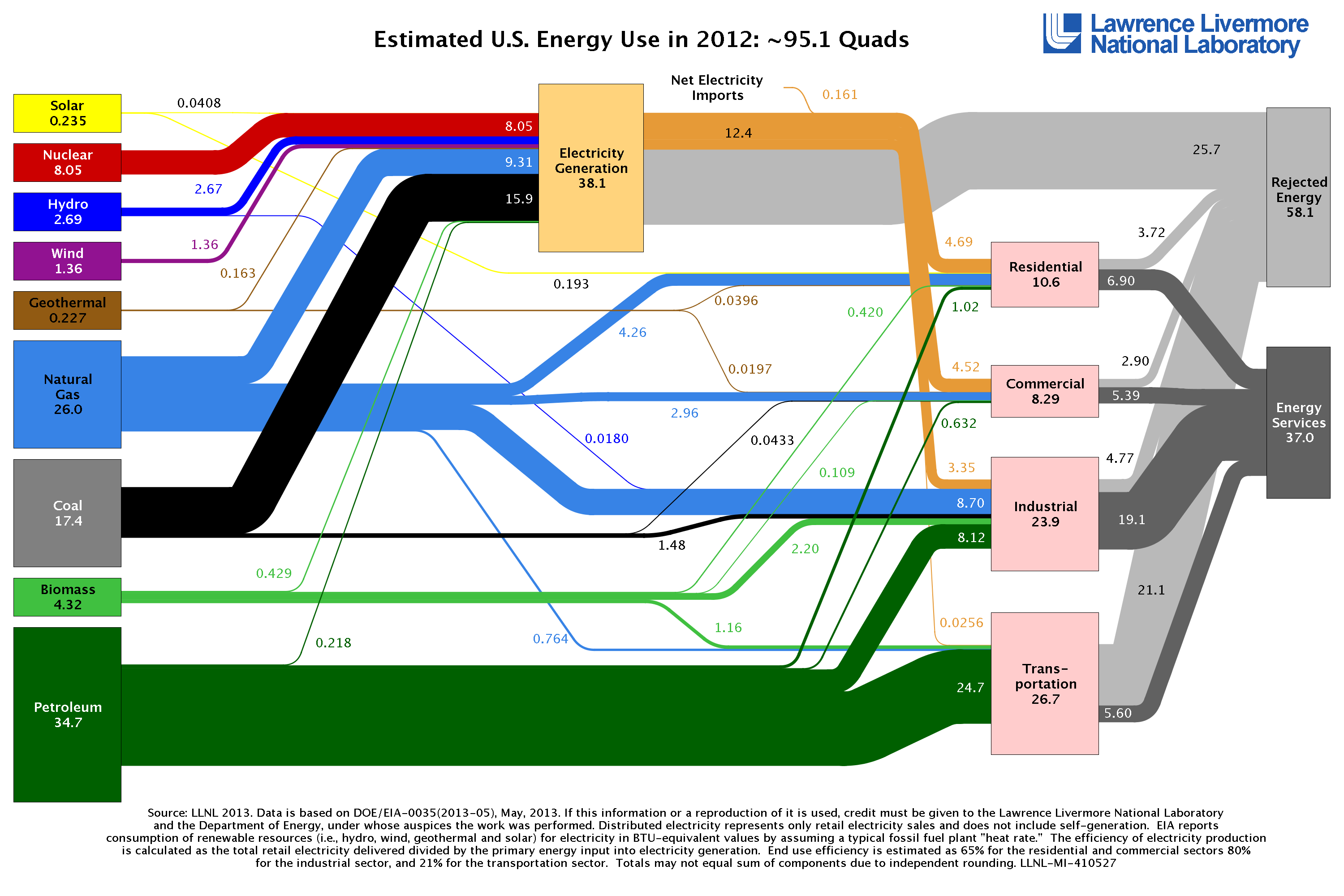
Here’s the most recent example, showing energy use in the US for 2012 (click for a larger image):
Estimated US Energy Use in 2012
For comparison, here is a link to the flow diagram for 2002.
Take a moment to absorb the graphic — it contains a lot of information. The sources of energy are on the left, the major consumption sectors (Residential, Commercial, Industrial and Transportation) towards the right, and there’s a stop-off point between the two, where raw energy sources are converted to electricity. The relative thickness of each connecting line shows how much energy travels along each path.
[Sidebar: About Quads: all of the numbers on the graphic are in quadrillion BTUs, or “Quads,” where 1 Quad equals 1,000,000,000,000,000 BTUs. One BTU is a unit of energy approximately equal to what you get by burning one match. Burning six teaspoons of gasoline generates about 1000 BTUs. But, in this post, we’re more interested in the relative amounts of energy used — the percentages — and less interested in the absolute BTUs.]
There are a few things that stand out in this graphic.
Oil is primarily used to make gasoline. Coal is primarily used to generate electricity. This should be no surprise to anyone who has studied energy use, but it is useful to keep that in mind. If your goal is to reduce greenhouse gas emissions, more efficient use of gasoline and electricity is a good place to start.
Coal usage is decreasing but is still the dominant source of fuel for generating electricity. Over 40% of all electricity produced in the US starts with coal. Ten years ago, coal produced 52% of all electricity in the United States, but this percentage has been decreasing as natural gas and renewable sources increase.
A lot of energy is lost in the generation and distribution of electricity. Our electrical system is only 33% efficient: it takes three units of raw energy (coal, nuclear, gas, etc.) to generate and deliver one unit of electricity to your home. Stated another way, if you cut your own consumption by one BTU, some generation plant somewhere will consume three fewer BTUs.
Internal Combustion cars and trucks are only 20% efficient. For every five gallons of gasoline you burn, on average, only one gallon does useful “work” (in the terms a physicist would use). The other four gallons turn into wasted heat. (Note: I know this isn’t a particularly useful way to measure efficiency for cars and trucks — we’ll visit “well to wheel” efficiency figures in a subsequent post.)
What else can we learn from the flow diagram? The flow diagram offers many starting points for exploration and discussion. For example:
Electric generation benefits from a diversity of raw energy sources. Ten years ago, geothermal, wind, and solar sources were lumped in with “biomass & other,” accounting for just 2.3% of the energy sources we use for electricity. Today, those sources account for 5.2% of electrical generation. While this is still small compared to the total feedstock used for electricity, the fact that there is a diversity of sources increases the opportunity for innovation. Both wind and solar continue to get cheaper, so one of those technologies will attain grid parity at some point.
Internal combustion cars are locked into a single source of energy: petroleum. I admit to being an aficionado of electric car technology, but looking at the flow diagram makes it abundantly clear that the cost of running an internal combustion vehicle is directly tied to the cost of petroleum. (More accurately, operating costs are tied to the cost of gasoline, which may or may not track the cost of crude oil).
Small changes in end-user consumption have large effects on raw energy use. Because the generation of electricity through thermal means is inherently inefficient, reducing the electricity consumption in your home by one kW-h has the effect of saving three kW-h at the generation plant. Similarly, every gallon of gas that you don’t burn in your car effectively frees up five gallons that can be more efficiently used in industrial and commercial applications. Yes, you can make a difference.
We’ve only scratched the surface of a much longer discussion. But I want to hear from you: did anything surprise you about the flow diagram? What else would you like to know that it doesn’t tell you?